
Some years ago I subscribed to The New Yorker. In recent months I have sometimes thought about canceling it, because I have hardly time to read anything. But when I lose myself in one of the long, well written articles every few weeks, I cannot but extend the subscription again – for me this is simply one of the best magazines out there.
Now that my interest in editorial illustration grows, The New Yorker has become a wonderful source of inspiration. So I sifted through some of the unread magazines from the last months, and here are a few examples I found:
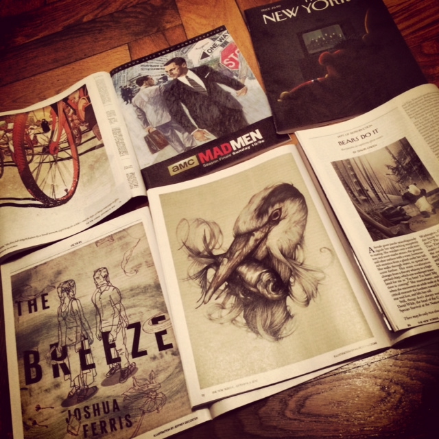
The New Yorker illustrations, © photo: Ines Häufler
On the top left you see an illustration by Victo Ngai, who I introduced to you here. You can read some details about the piece on her Tumblr.
The one on the top in the middle is not an illustration commissioned by the magazine, but an ad for the tv series Mad Men. The Mad Men team did not copy the style from a 1960ies ad, but they asked the illustrator Brian Sanders, now 75, who worked during that period and had exactly the style they were aiming for. Here is an article with more details. And here is an interview with Sanders on the official Mad Men blog, including some images of the process. I really like the mad Men’s team love for details and that they opted for the original style, and not for a (computer generated) “fake”.
On the top right you see the cover of The New Yorker from June 28th 2013 by Jack Hunter. It shows Ernie and Bert happy in front of the tv as the Supreme Court had allowed legal gay marriage. I like the serene atmosphere and minimalistic composition in combination with a strong pop cultural reference. Read a bit more about it here.
On the bottom row there is an illustration for a fiction piece, done by Jeffrey Decoster. I like simple linedrawings like this one a lot. And also how the red and blue lines indicate the distance and closeness between the man and the woman. There are many more on his website.
The bird in the middle is by Marco Mazzoni. He draws with coloured pencils. As you might have seen by now, I like illustrations that are not completely done in the computer. I like it if you can still see and feel the artistic skills like drawing. I guess I am a bit old school regarding that. Marco Mazzoni gives a lot of insight in his process on his Tumblr.
And the smaller piece on the bottom right is by Martin Ansin. The style of the image reminds me a bit of asian wood block prints. Though I can feel a lot of computer work in many of his pieces (but that is just a matter of taste, as I said I am a bit old school), there are a lot of very interesting poster designs for new and old movies in his portfolio. Check out this poster for Taxi Driver.
Comments 1
Pingback: Link(s) vom 9. Januar 2014 - e13.de